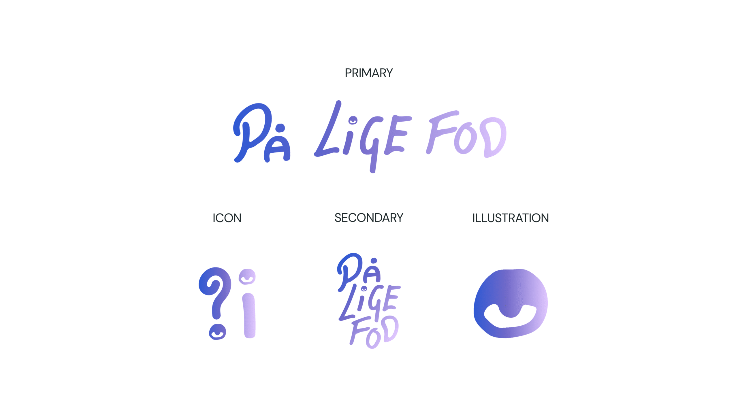
Deliverables
- Logo
- Logo animations
På Lige Fod
På Lige Fod is a Danish expression that goes beyond its literal translation, “On Equal Footing.” It describes the idea of meeting others as equals—with the same opportunities, rights, and respect, regardless of background or circumstances. Developed by Amagerplanen, the initiative helps young people without Danish citizenship navigate the path toward permanent residency and citizenship, ensuring they have access to the knowledge and support needed to make informed decisions about their future.
The identity
The visual identity was designed to communicate guidance, trust, and empowerment rather than authority or bureaucracy. At the heart of the identity is a custom handwritten logotype, created to feel human, approachable, and personal. The typography evokes the feeling of an important handwritten note—something from a friend, family member, or trusted teacher—drawing attention to information that matters while conveying genuine care and support.
This human-centered approach was essential to the concept. The identity needed to reflect real people helping real people, building trust through warmth, accessibility, and authenticity. The gradient further reinforces this narrative, symbolizing the journey from uncertainty and complexity toward clarity and opportunity.
Rather than positioning itself as part of the system, På Lige Fod acts as a trusted guide, helping young people understand their options.