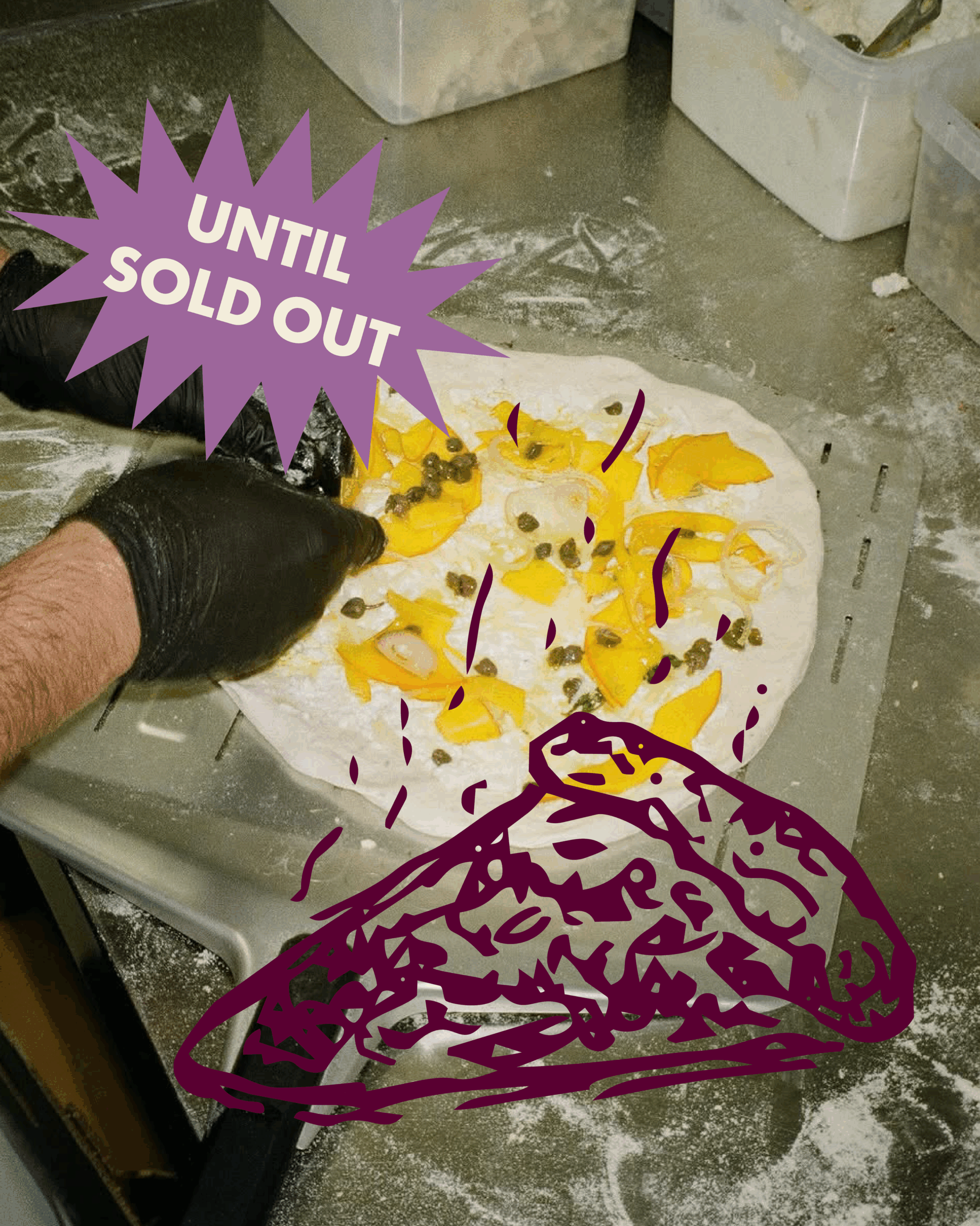
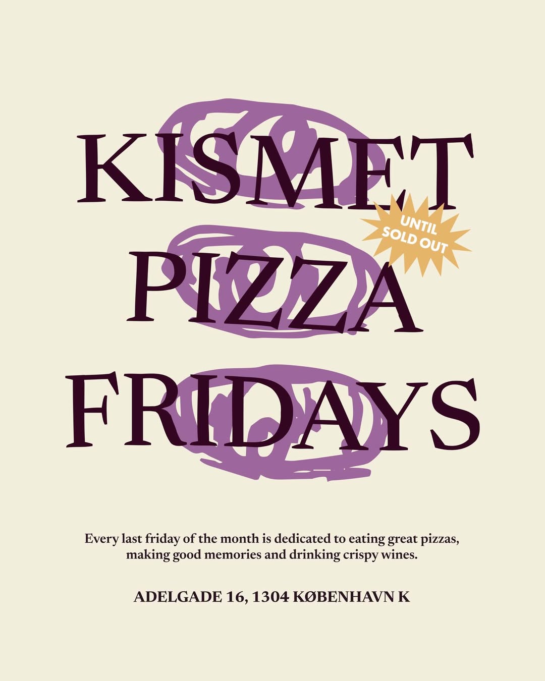
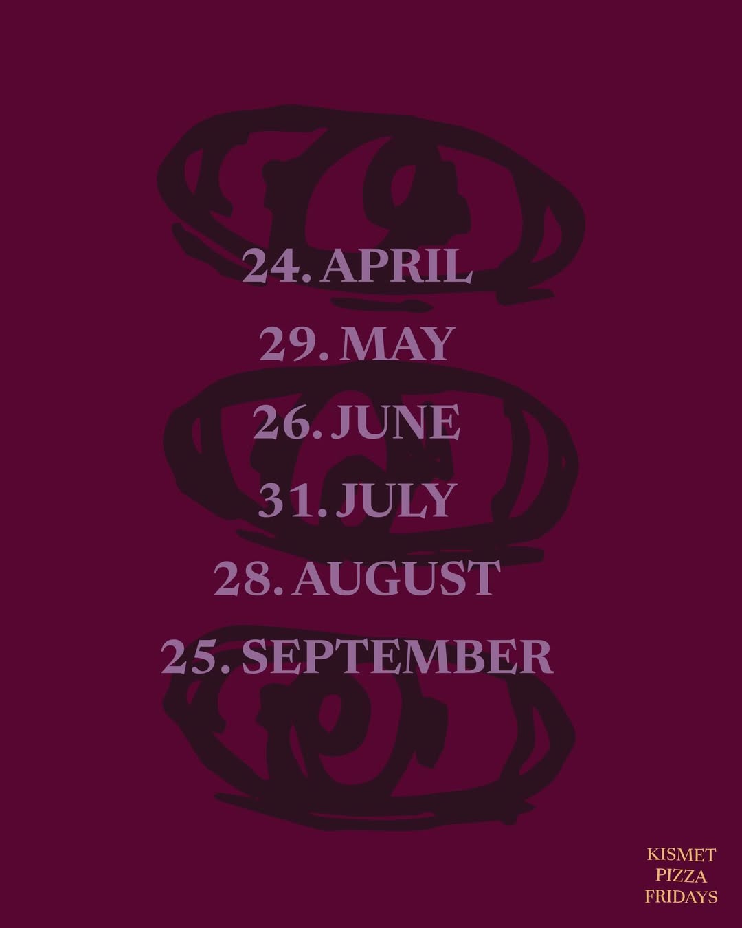
For Kismet’s recurring event series Kismet Fridays, we developed a set of custom illustrations and a dedicated color palette to give the events a distinct visual identity while still aligning with the café’s overall brand.
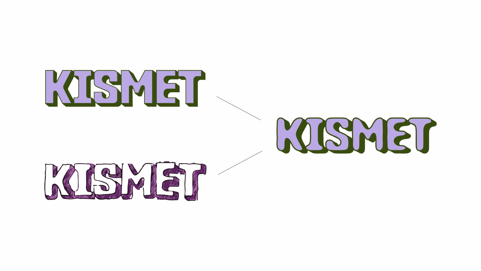
Kismet currently uses both a structured logo and a more expressive hand-drawn version. For the Friday events, the team wanted a graphic direction that would sit somewhere between these two styles—retaining the recognizability of the existing brand while introducing a more playful and illustrative feel suited to the atmosphere of the events.
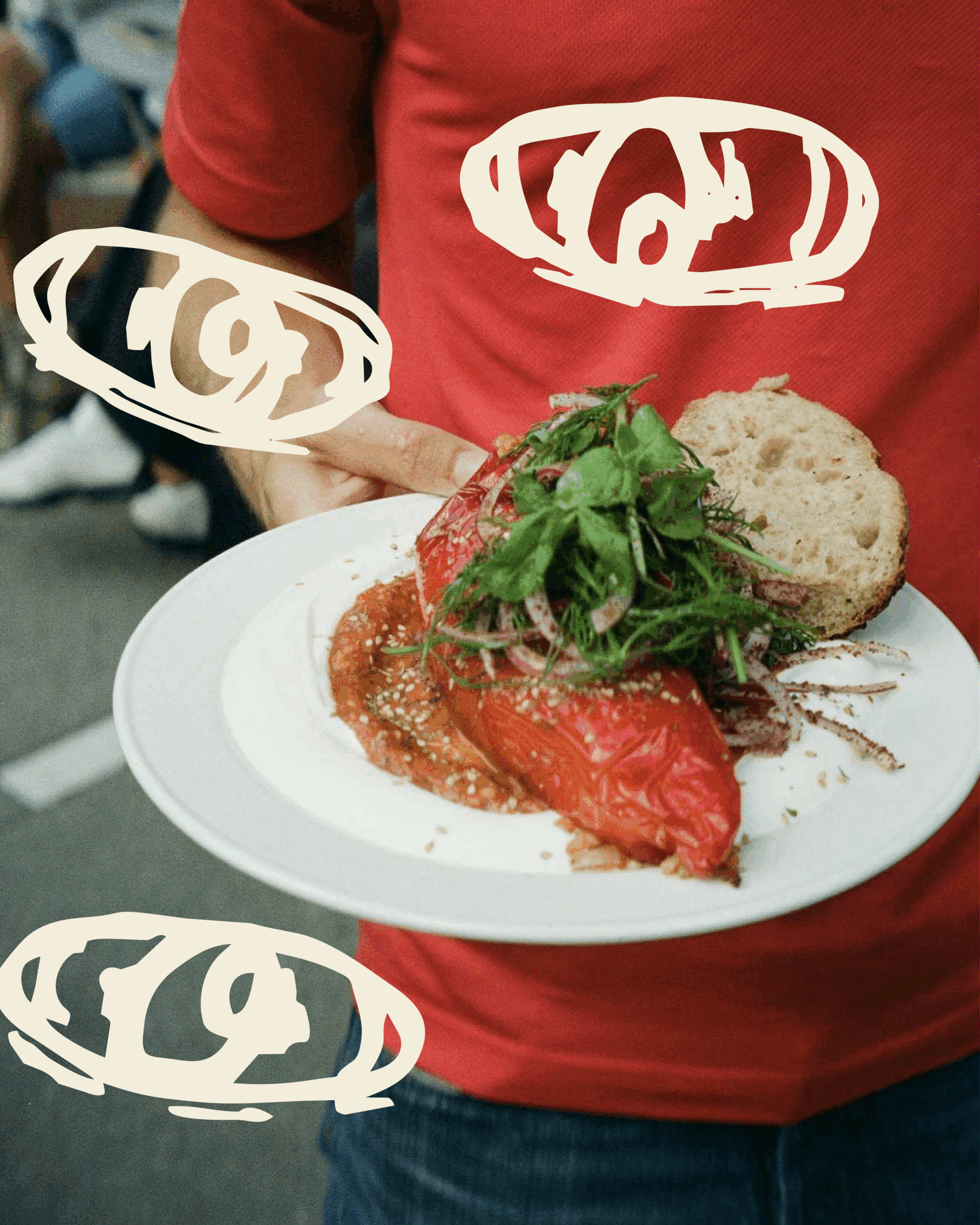
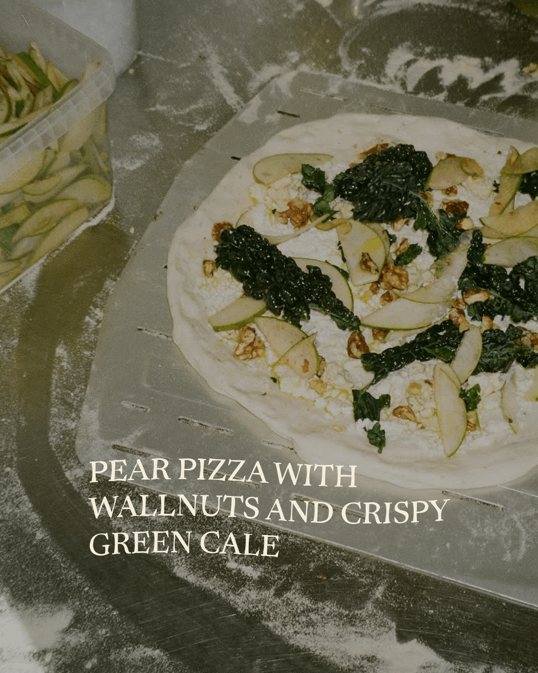
To support this, I created a graphic interpretation of the logo specifically for the Kismet Fridays concept, bridging the gap between the clean and the hand-drawn expressions. In addition, I designed a series of illustrations used across event materials and developed merchandise that could be sold during the Friday gatherings.
The result is a visual language that feels unique to Kismet Fridays while remaining clearly connected to the café’s identity.